Plot Multiple Vector Layers
Last updated on 2026-02-05 | Edit this page
Estimated time: 45 minutes
Overview
Questions
- How can I create map compositions with custom legends using ggplot?
- How can I plot raster and vector data together?
Objectives
- Plot multiple vector layers in the same plot.
- Apply custom symbols to spatial objects in a plot.
Things You’ll Need To Complete This Episode
See the lesson homepage for detailed information about the software, data, and other prerequisites you will need to work through the examples in this episode.
This episode builds upon the previous episode to work with vector layers in R and explore how to plot multiple vector layers.
Load the Data
To work with vector data in R, we will exclusively use the
terra package. sf could also be used.
We will continue to work with the three ESRI shapefile
that we loaded in the Open
and Plot Vector Layers in R episode.
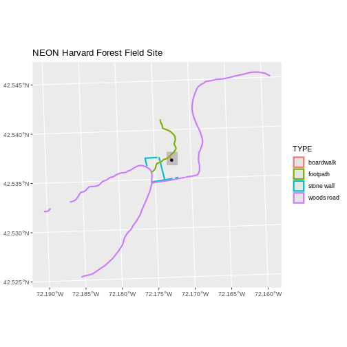
Plotting Multiple Vector Layers
In the previous episode, we learned how to plot information from a single vector layer and do some plot customization including adding a custom legend. However, what if we want to create a more complex plot with many vector layers and unique symbols that need to be represented clearly in a legend?
Now, let’s create a plot that combines our tower location
(point_harv), site boundary
(aoi_boundary_harv) and roads (lines_harv)
spatial objects. We will need to build a custom legend as well.
To begin, we will create a plot with the site boundary as the first
layer. Then layer the tower location and road data on top using
+.
Note that the legend only contains the lines, because that’s where an aesthetic uses a variable.
R
ggplot() +
  geom_spatvector(data = aoi_boundary_harv, fill = "grey", color = "grey") +
  geom_spatvector(data = lines_harv, aes(color = TYPE), size = 1) +
  geom_spatvector(data = point_harv) +
  ggtitle("NEON Harvard Forest Field Site") +
  coord_sf()
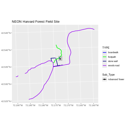
Next, let’s customize legend a bit using the symbology (the colors
and symbols) that we used to create the plot above. For example, it
might be good if the lines were symbolized as lines (instead of the
default little squares). In the previous episode, you may have noticed
that the default legend behavior for geom_spatvector is to
draw a ‘patch’ for each legend entry. If you want the legend to draw
lines or points, you need to add an instruction to the
geom_spatvector call - in this case,
show.legend = 'line'.
R
ggplot() +
  geom_spatvector(data = aoi_boundary_harv, fill = "grey", color = "grey") +
  geom_spatvector(data = lines_harv, aes(color = TYPE),
          show.legend = "line", size = 1) +
  geom_spatvector(data = point_harv, aes(fill = Sub_Type), color = "black") +
  scale_color_manual(values = road_colors) +
  scale_fill_manual(values = "black") +
  ggtitle("NEON Harvard Forest Field Site") +
  coord_sf()
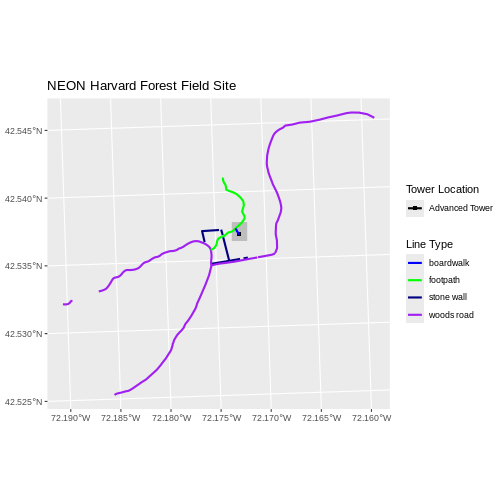
Now lets adjust the legend titles by passing a name to
the respective color and fill palettes.
R
ggplot() +
  geom_spatvector(data = aoi_boundary_harv, fill = "grey", color = "grey") +
  geom_spatvector(data = point_harv, aes(fill = Sub_Type)) +
  geom_spatvector(data = lines_harv, aes(color = TYPE), show.legend = "line",
          size = 1) +
  scale_color_manual(values = road_colors, name = "Line Type") +
  scale_fill_manual(values = "black", name = "Tower Location") +
  ggtitle("NEON Harvard Forest Field Site") +
  coord_sf()

Finally, it might be better if the points were symbolized as a
symbol. We can customize this using shape parameters in our
call to geom_spatvector: 16 is a point symbol, 15 is a
box.
Data Tip
To view a short list of shape symbols, type
?pch into the R console.
R
ggplot() +
  geom_spatvector(data = aoi_boundary_harv, fill = "grey", color = "grey") +
  geom_spatvector(data = point_harv, aes(fill = Sub_Type), shape = 15) +
  geom_spatvector(data = lines_harv, aes(color = TYPE),
          show.legend = "line", size = 1) +
  scale_color_manual(values = road_colors, name = "Line Type") +
  scale_fill_manual(values = "black", name = "Tower Location") +
  ggtitle("NEON Harvard Forest Field Site") +
  coord_sf()
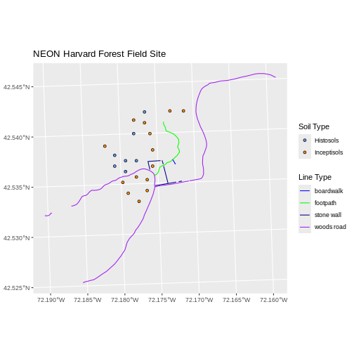
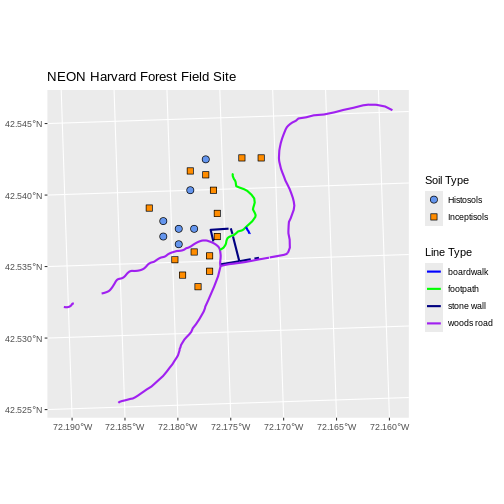
Challenge: Plot Polygon by Attribute
Using the
NEON-DS-Site-Layout-Files/HARV/PlotLocations_HARV.shpESRIshapefile, create a map of study plot locations, with each point colored by the soil type (soilTypeOr). Make the colors “cornflowerblue” and “darkorange”. How many different soil types are there at this particular field site? Overlay this layer on top of thelines_harvlayer (the roads). Create a custom legend that applies line symbols to lines and point symbols to the points.Modify the plot above. Tell R to plot each point, using a different symbol of
shapevalue.
First we need to read in the data and see how many unique soils are
represented in the soilTypeOr attribute.
R
plot_locations <-
  vect("data/NEON-DS-Site-Layout-Files/HARV/PlotLocations_HARV.shp")

plot_locations$soilTypeOr <- as.factor(plot_locations$soilTypeOr)
levels(plot_locations$soilTypeOr)
OUTPUT
[1] "Histosols" "Inceptisols"Next we can create a new color palette with one color for each soil type.
R
blue_orange <- c("cornflowerblue", "darkorange")
Alternative Color Palettes
You can modify the default R color palette using the palette method.
For example palette(rainbow(6)) or
palette(terrain.colors(6)). You can reset the palette
colors using palette("default")!
You can also use colorblind-friendly palettes such as those in the viridis package.
Finally, we will create our plot.
R
ggplot() +
  geom_spatvector(data = lines_harv, aes(color = TYPE), show.legend = "line") +
  geom_spatvector(data = plot_locations, aes(fill = soilTypeOr),
          shape = 21, show.legend = 'point') +
  scale_color_manual(name = "Line Type", values = road_colors,
     guide = guide_legend(override.aes = list(linetype = "solid",
                                              shape = NA))) +
  scale_fill_manual(name = "Soil Type", values = blue_orange,
     guide = guide_legend(override.aes = list(linetype = "blank", shape = 21,
                                              colour = "black"))) +
  ggtitle("NEON Harvard Forest Field Site") +
  coord_sf()
If we want each soil to be shown with a different symbol, we can give
multiple values to the scale_shape_manual() argument.
R
ggplot() +
  geom_spatvector(data = lines_harv, aes(color = TYPE), show.legend = "line", size = 1) +
  geom_spatvector(data = plot_locations, aes(fill = soilTypeOr, shape = soilTypeOr),
          show.legend = 'point', size = 3) +
  scale_shape_manual(name = "Soil Type", values = c(21, 22)) +
  scale_color_manual(name = "Line Type", values = road_colors,
     guide = guide_legend(override.aes = list(linetype = "solid", shape = NA))) +
  scale_fill_manual(name = "Soil Type", values = blue_orange,
     guide = guide_legend(override.aes = list(linetype = "blank", shape = c(21, 22), color = "black"))) +
  ggtitle("NEON Harvard Forest Field Site") +
  coord_sf()
- Use the
+operator to add multiple layers to a ggplot. - Multi-layered plots can combine raster and vector datasets.
- Use the
show.legendargument to set legend symbol types. - Use the
scale_fill_manual()function to set legend colors.